

If there’s one thing about Nothing’s entire philosophy as a company that rings completely true, it’s that modern tech looks boring. With focus applied to manufacturing efficiency and broad appeal, the most impressive aesthetics we can get from mainstream phones these days come down to a handful of colour options or an interesting camera bump, with clean-looking backsides to match equally sparse glass screens. The Nothing Phone 3 tries something quite different, mixing practical minimalism and an eye-catching design language into a solid flagship.
I’ve seen folks praise these phones for their focus on reserved user interfaces, while others applaud the unique aesthetics – looking more cassette-futurism than simply sci-fi – but both descriptions apply well across the company’s family of products. With the Phone 3, Nothing wants to draw people in with a far-reaching design that is paradoxically both simple and extra with its most powerful device yet.
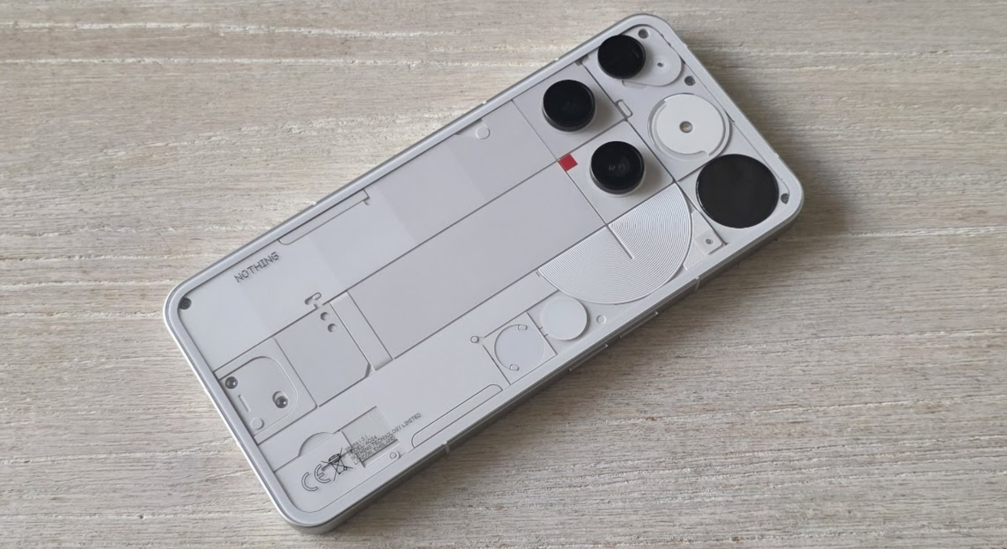
The exterior, adorned with plenty of plastic to invoke a faux see-through look, along with a pixelated ‘Glyph Matrix’ on the back that can run several animations with varying levels of practicality (and fun), feed into an extremely deliberate style completely unique to Nothing’s tech.

Conversely, the company’s Android version ‘Nothing OS’ goes for a bold monochrome look, completely foreign to any other consumer-oriented user interface. It shifts between New Roman-like fonts and dotted lettering, while the system is ultimately built around a focus on disconnecting from your tech. The ‘Essential Key’ below the standby button on the right side of the handset allows you to take quick voice memos and jot notes down to then access later in one unified ‘Nothing Space’ app, incentivising minimalism by treating the phone as more of a reminder box.
This approach is growing on me, but I’m not sure the Nothing Phone 3’s point of difference is compelling enough to pull me away from phones like the Google Pixel 9, the Samsung Galaxy S25, or even Nothing’s own Phone 3a Pro, which was released in March 2025.
To be clear, I don’t think the Phone 3 is a bad phone, but I do think it’s risky for a niche brand like Nothing to get in direct competition with the market-leading flagships, which outmaneuver it on spec and wider support. Nothing will surely have its fans with the Phone 3, but it also lacks the broad appeal of the phones it’s trying to compete with.
Nothing to see here

The Nothing Phone 3 has such a divisive exterior aesthetic to it. The layout of the camera array seems kind of ridiculous. The lenses are positioned seemingly nonsensically, with the microphone and telephoto lenses positioned off-centre in the top left corner, and the wide and ultrawide lenses below it.
It’s only when taking in the rest of the exterior that it makes a little bit more sense, but even then you’d have to really want the Nothing Phone 3 to like this aesthetic. I adore it – it evokes an 80s-90s cassette futurism vibe that makes me think of the chunky computers from Starfield, Alien or 2001: A Space Odyssey. A red square on the back flashes as a video recording icon, while the lines and shapes are meant to evoke the imagery of the handset’s circuitry and internal parts. This approach to aesthetic maximalism is best exemplified by the Glyph Matrix, though.
This is a really weird feature for a smartphone. This small circle of large pixels can run through several features (interactive with the back button below the panel), such as displaying battery life, acting as a level, offering advice as an eight ball and functioning as a stopwatch. The most useful feature I’ve found is using the panel to view a pixelated depiction of yourself, allowing you to take selfies using your rear cameras. It’s a neat feature!

Is any of this necessary? Nope, but that’s not the point. Nothing’s pretty explicit about wanting to make a ‘fun’ phone that’s as exciting as it is useful, and this third generation of the glyph matrix idea, evolving from simple flashing lights on previous handsets, hits the nail on the head. That said, I find the near-minimalist operating system to not gel as well with this design, and the user interface doesn’t have much of the flair it needs to truly be iconic.
I’ve tried really hard to commit to the operating system offered here. I’ve migrated my standard smartphone use over almost entirely to the Phone 3, applied the brand’s iconic ‘glass’ wallpaper filter, switched the icons to Nothing’s monochrome (as opposed to Android’s standard Material You coloring, which is also available) and have even taken advantage of the brand’s exceptional widgets.
Nothing’s approach to widgets is second to none. Having quick action buttons such as Bluetooth, Wi-Fi, Airplane Mode and Hotspot accessible from the Home Screen without having to swipe the quick settings menu down is really cool. The same goes for all of the other widgets offered by Nothing – the company’s weather widgets look great, and the inbuilt media player widget is exactly what I’ve wanted from Google and Samsung for years.
But then the phone rubs up against the rest of Android – the stuff it has limited ability to change – and you start to see the cracks forming, with Android’s neutral design visible in some menus. But while this breaks the immersion, the thing limiting Nothing’s success more is its ambitious position in the market.
Nothing to it

The Phone 3 is properly separate from the rest of the Nothing range, as it’s the only smartphone designed and priced to directly compete with flagship handsets offered by Apple, Samsung and Google – but it feels like we’re veering off course from what Nothing is actually trying to do in the smartphone market.
Make no mistake, the powerful camera set, Snapdragon 8s Gen 4 processor and gorgeous display put the Phone 3 well above Nothing’s previously released handsets in terms of quality and capability, but compared to other leading brands, the phone underperforms.
I’d argue the more premium price point and specs kind of diminish the whole point of a Nothing phone. Take the Essential Key, a multi-button for writing notes, recording voice memos, taking screenshots and launching the Nothing Space, where you can view all of these things. This tool doesn’t actually require much processing power to work smoothly, and indeed it fits quite well into the ecosystem of the considerably cheaper 3a and 3a Pro. It’s a good feature, but it doesn’t feel like the higher price point is doing much to improve it (though, as I wrote in my 3a Pro article, I would like the choice to remap the button).

Conversely, the cameras absolutely need improvement, and I would have happily traded the more powerful processor for better photography. I’ve included reference images below of a car I’ll be reviewing soon, the Porsche Macan 4 electric, but know that there’s detail missing from the shots that I don’t believe would have been an issue had I captured the same images with the Google Pixel 9 or the iPhone 16.
Perhaps the Nothing Phone 3 is holding court until the arrival of an even better equipped Phone 3 Pro to take on the iPhone 16 Pro and Galaxy S25 Ultra. For now, these cameras don’t really keep up.
Image 1 of 4


I’m taking a hard stance on the Nothing Phone 3 because, while I love what the London-based company is trying to do and am indeed swayed by the aesthetics, I believe this phone could have benefited from a slightly more competitive, or conservative, arrangement of features.
The cameras are fairly unimpressive and the processor, for its added performance, still doesn’t keep up as well as with more established rivals (and even cheaper handsets from mentioned rivals). It kind of feels like Nothing’s tied up – when your goals are minimalism and maximalism, how do you find the right fit?
A premium price makes the device more of an eyebrow-raiser to casual customers, but looking at Nothing’s focus on a healthier relationship with technology, the extra additions don’t feel substantiated, particularly for an inherently niche userbase that Nothing is restricted to by virtue of its divisive aesthetics.
Should you buy Nothing?

Nothing has created an awesome handset with the Phone 3. One that truly challenges the Galaxy S25 and Pixel 9 families. However, its strong commitment to niche aesthetics makes it exactly that – niche.
I’m among the folks that love this design approach – one that does accomplish the goal of make tech fun-looking – but as someone who needs broader utility from a flagship handset, I don’t think the Phone 3 is for me.
The Nothing Phone 3 will be a capable handset for those craving fast recharging speeds, great on-device processing performance, high framerate gameplay and even some casual photography. And, if you like the aesthetic, then you’ll be pleased to know that the Phone 3 is cheaper than all of its major competitors.
That being said, the underwhelming array of cameras certainly leaves something to be desired and, although it’s a fairly cost-effective handset, I would highly recommend waiting for it to go on sale.
Major phonemakers are likely not too worried about Nothing at the moment, but it’s getting close to a perfectly balanced device here.
If you like the Nothing approach to handsets and want to save some money, I recommend reading our Nothing Phone 3a Pro review.